


You may have felt limited at times if you've been writing blogs in plain Markdown. I mean, Markdown is great and all, but sometimes you need more than just headings and paragraphs, don't you? That's where shortcodes come in, and believe me, they make a big difference.
Today, I'm going to walk you through how to use shortcodes in your blog posts, and I'll be using examples from two awesome open source projects:
- Astroplate - A production-ready Astro boilerplate
- Nextplate - A Next.js boilerplate with the same shortcodes
What is cool? Both projects have the same shortcodes, but they are set up differently for each framework. So, no matter if you're on team Astro or team Next.js, you're good to go!
What Are Shortcodes Anyway?
Shortcodes are like small building pieces that you may add to your blog posts. You don't have to write complicated HTML or JavaScript every time you want a button or an accordion. Instead, you can just use a basic component tag. It's like having a toolbox full of ready-to-use UI components.
Instead of writing a lot of HTML for a beautiful button, you could just write:
<Button label="Click Me" link="/somewhere" style="solid" />
And bang! You have a button that looks great and works well. No trouble, no mess.
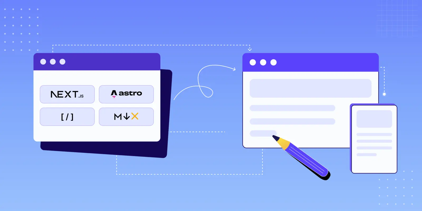
Getting Started with MDX
Let's discuss about MDX before we get into the shortcodes. You can use React components right inside your markdown files, which is like Markdown on steroids. That's pretty cool, right?
For Astro Users
You're lucky if you use Astro (or Astroplate). There is built-in support for MDX. In your content directory, just make files with the .mdx extension:
src/
content/
blog/
my-awesome-post.mdx
That's all. Really.
For Next.js Users
If you use Next.js or Nextplate, MDX support is already set up for you. The project uses next-mdx-remote to show MDX material. If you're starting from scratch, you'll need:
npm install next-mdx-remote remark-gfm
The Nextplate boilerplate already has this set up in the MDXContent component, which is in charge of rendering markdown/MDX with shortcode components. You don't need to set up anything else in next.config.js for MDX!
How Nextplate Configures Shortcodes
The MDXContent component in Nextplate makes shortcodes available in all of your blog posts automatically. This is how it works:
Project Structure:
src/
  layouts/
    shortcodes/
      Button.tsx
      Notice.tsx
      Accordion.tsx
      Tabs.tsx
      Tab.tsx
      Youtube.tsx
      Video.tsx
      all.tsx          # Exports all shortcodes
    helpers/
      MDXContent.tsx   # Renders MDX with shortcodes
  content/
    blog/
      *.md             # Your blog posts (use .md extension)
Key Configuration Files:
- src/layouts/shortcodes/all.tsx - Exports all shortcode components
- src/layouts/helpers/MDXContent.tsx - Uses
next-mdx-remotewithremark-gfmplugin
You don't need to import anything to use the MDXContent component because it automatically adds all shortcodes to your markdown files.
The Shortcodes You'll Actually Use
Okay, let's get to the exciting part! These are the shortcodes I use all the time in my blog posts. I'll show you how each one works with real examples.
1. Buttons - Because Links Deserve to Look Good
Let's begin with something easy: buttons. They are great for CTAs, download links, or just making your links stand out. This is what they look like:
Code:
<Button label="Primary Button" link="#" style="solid" />
<Button label="Outline Button" link="#" style="outline" />
Props:
label: The text displayed on the buttonlink: URL or path to navigate tostyle: Either "solid" or "outline"rel: SEO relationship (optional, defaults to "nofollow")
2. Notice Boxes - Get Your Reader's Attention
You know those bright callout boxes that are in documentation? Yes, those. They are quite helpful for drawing attention to essential things. There are four flavors:
Code:
<Notice type="note">Your content here</Notice>
<Notice type="tip">Your content here</Notice>
<Notice type="info">Your content here</Notice>
<Notice type="warning">Your content here</Notice>
3. Accordions - Hide the Details (Until They're Needed)
For FAQs and extensive explanations, I always use accordions. They maintain your page neat and tidy while yet giving you all the information. Click to make it bigger, then click again to make it smaller. Simple as that:
Code:
<Accordion title="Your Question Here">
  Your answer content here - can include markdown formatting!
</Accordion>
For Astro users: The client:load directive informs Astro to hydrate components when the site loads. In Nextplate (Next.js), this directive is not used—components are automatically interactive.
4. Tabs - When You Need Multiple Views
When you want to demonstrate the same item in different ways, like code examples for different frameworks (hint hint, Astro vs. Next.js), tabs are great. This is how they work:
Code:
<Tabs>
  <Tab name="Tab 1">Content for first tab</Tab>

  <Tab name="Tab 2">Content for second tab</Tab>
</Tabs>
5. Videos - Because Sometimes You Need to Show, Not Tell
YouTube Videos
Want to embed a YouTube video? Super easy:
Code:
<Youtube id="C0DPdy98e4c" title="Play:Youtube" />
Just grab the video ID from the YouTube URL (you know, the part after v=).
Custom Videos
Got your own videos? No problem:
Code:
<Video width="100%" src="path/to/your/video.mp4" />
Standard Markdown Elements
Of course, you've still got all your regular Markdown superpowers. Here's a quick refresher:
Headings
Use # for headings (H1 through H6):
# Heading 1

## Heading 2

### Heading 3
Text Formatting
- Bold text with
**text** - Italic text with
*text* Strikethroughwith~~text~~Inline codewith backticks
Lists
Ordered lists:
- First item
- Second item
- Third item
Unordered lists:
- List item
- List item
- List item
Code Blocks
To highlight syntax, use three backticks with a language name:
function greet(name) {
  console.log(`Hello, ${name}!`);
}
def greet(name):
    print(f"Hello, {name}!")
Blockquotes
Use the
>sign to make nice blockquotes. Great for making statements, testimonials, or key callouts stand out.
Tables
Create structured data with markdown tables:
| Feature | Astro | Next.js |
|---|---|---|
| MDX Support | ✅ Built-in | ✅ Via Plugin |
| Performance | ⚡ Excellent | ⚡ Excellent |
| Learning Curve | 📚 Easy | 📚 Moderate |
Code:
| Feature | Astro | Next.js |
| : ------------- | : ----------: | ------------: |
| MDX Support | ✅ Built -in  | ✅ Via Plugin |
| Performance | ⚡ Excellent |  ⚡ Excellent |
| Learning Curve |   📚 Easy |   📚 Moderate |
Want to Build Your Own?
Once you get comfortable with these shortcodes, you might want to create your own. It's not that hard, really! Here's how to make the Button and Notice components:
Button Component (React/TSX)
Here's how the Button component is actually implemented in Nextplate:
import Link from "next/link";

const Button = ({
  label,
  link,
  style,
  rel,
}: {
  label: string;
  link: string;
  style?: string;
  rel?: string;
}) => {
  return (
    <Link
      href={link}
      target="_blank"
      rel={`noopener noreferrer ${
        rel ? (rel === "follow" ? "" : rel) : "nofollow"
      }`}
      className={`btn mb-4 me-4 no-underline hover:text-white dark:hover:text-black ${
        style === "outline" ? "btn-outline-primary" : "btn-primary"
      }`}
    >
      {label}
    </Link>
  );
};

export default Button;
Key differences from basic implementation:
- Uses Next.js
Linkcomponent for optimized navigation - Includes dark mode support with
dark:hover:text-black - Adds utility classes for spacing and hover effects
Notice Component (React/TSX)
The Notice component in Nextplate includes custom SVG icons for each type:
import { humanize } from "@/lib/utils/text-converter";
import React from "react";

function Notice({
  type,
  children,
}: {
  type: string;
  children: React.ReactNode;
}) {
  return (
    <div className={`notice ${type}`}>
      <div className="notice-head">
        {/* SVG icons for tip, info, warning, and note types */}
        {type === "tip" ? (
          <svg width="20" height="20" viewBox="0 0 24 24" fill="none">
            {/* Checkmark icon for tips */}
          </svg>
        ) : type === "info" ? (
          <svg width="20" height="20" viewBox="0 0 18 20" fill="none">
            {/* Info icon */}
          </svg>
        ) : type === "warning" ? (
          <svg width="20" height="20" viewBox="0 0 20 20" fill="none">
            {/* Warning X icon */}
          </svg>
        ) : (
          <svg width="20" height="20" viewBox="0 0 20 20" fill="none">
            {/* Note icon */}
          </svg>
        )}
        <p className="my-0 ml-1.5">{humanize(type)}</p>
      </div>
      <div className="notice-body">{children}</div>
    </div>
  );
}

export default Notice;
Note: The actual component includes full SVG paths for each icon type. It also uses the humanize utility to format the type name.
Some Tips I've Learned Along the Way
Here are some things I wish someone had told me when I started using shortcodes!
- Don't Go Overboard: Just because you can use shortcodes everywhere doesn't mean you should. Use them where they actually add value.
- Stay Consistent: Pick a style and stick with it. Your readers will appreciate the consistency.
- Think About Performance: In Astro, use
client:loadonly when you really need immediate interactivity. For stuff below the fold,client:visibleis your friend. - Test on Mobile: I can't stress this enough. Always check how your shortcodes look on a phone. Always.
- Accessibility First: Make sure everything works with a keyboard and screen readers. It's not just good practice—it's the right thing to do.
- Keep a Cheat Sheet: I literally have a note with all my shortcode syntax. Saves me so much time!
Framework-Specific Stuff
Depending on whether you're using Astro or Next.js, there are a few framework-specific things worth knowing:
If You're Using Astro (or Astroplate)
- Use
client:loadfor interactive components that need immediate interactivity - Use
client:visiblefor components that can wait until they're in viewport - Use
client:idlefor lower-priority interactive components - Keep most content as static HTML for optimal performance
- Leverage Astro's partial hydration for better performance
If You're Using Next.js (or Nextplate)
- Use dynamic imports for heavy components
- Leverage Next.js Image component for optimized images
- Consider using the App Router for better MDX integration
- Use TypeScript for better component type safety
- Implement proper SEO with metadata API
Conclusion
I understand that plain Markdown is easy and that's great. But occasionally your blog postings need a little more power. Shortcodes do just that. These components make your material much more interesting, whether you're using Astroplate for a quick Astro experience or Nextplate for the Next.js ecosystem.
Begin with little steps! Start by learning 2–3 shortcodes, and then add more as you get more comfortable.
And the best part is that what I've shown you today is only the tip of the iceberg. You may make custom components for just about anything, like image galleries, comparison tables, interactive demos, and more. There are no limits!
Happy blogging! 🚀
